CNN Arabic
This is a collection of work I’ve done while interning at CNN Arabic. I created different types of infographics based on the information that needs to be delivered. For example, creating icons to visualize symptoms if we are talking about a health topic. I also created map infographics which usually visualizes the top countries worldwide and we mainly focus on the Arab countries since it is more relevant to our viewers.
Hover and click on any of the work to be redirected to the published version on the CNN Arabic website*
Arab countries income level 2022-2023


Covid vaccine side effects in children


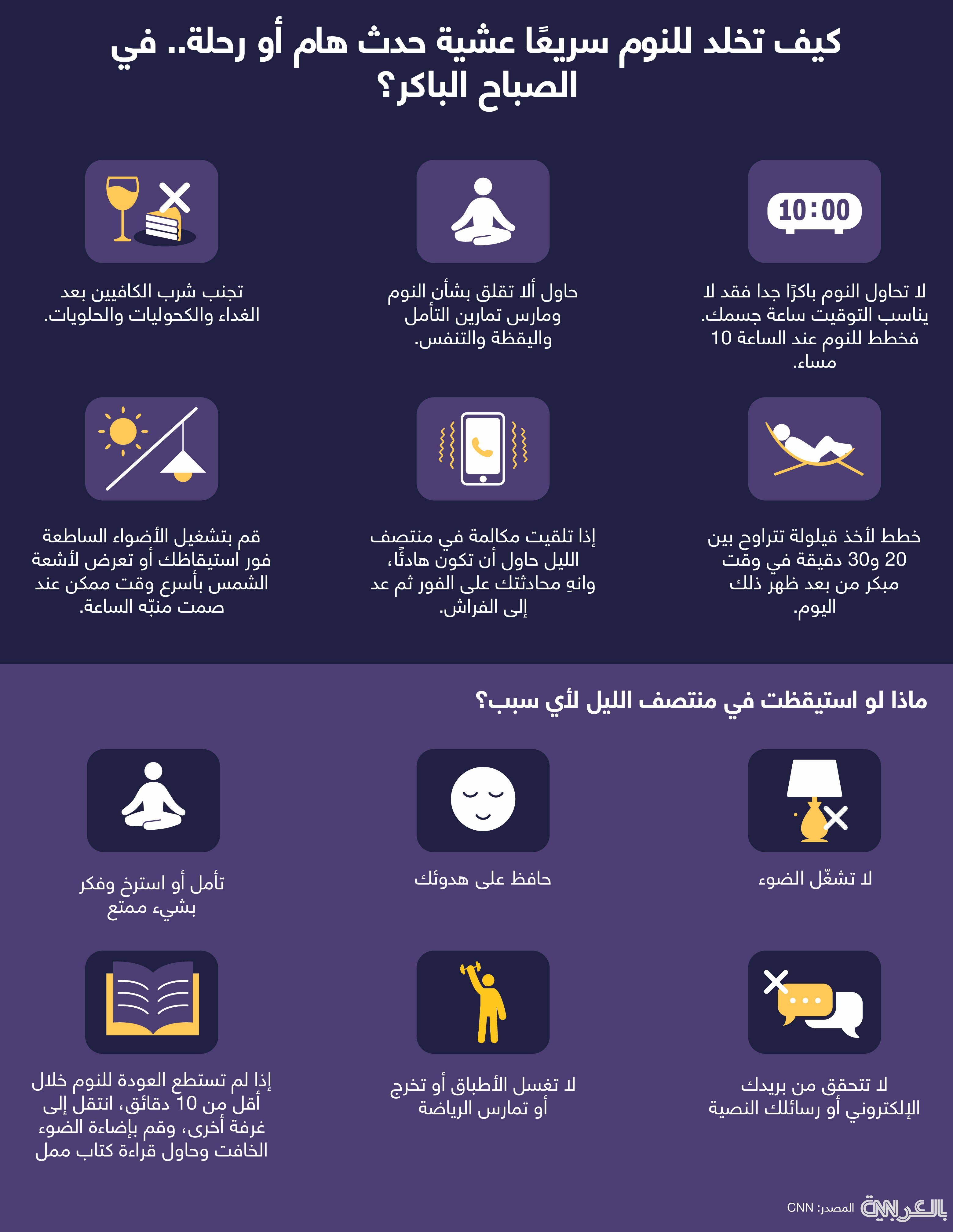
Good sleep before an important early event
hjj

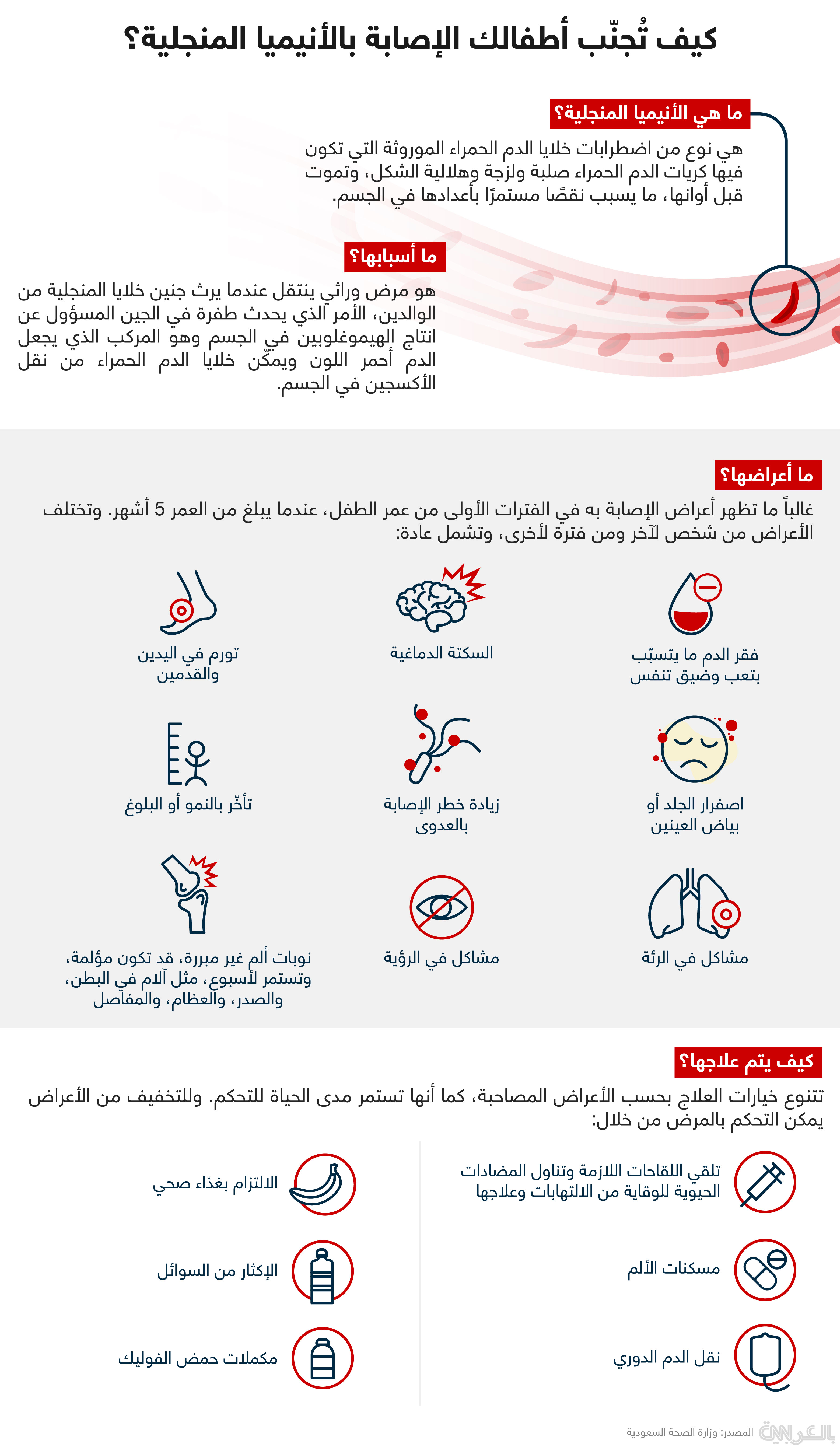
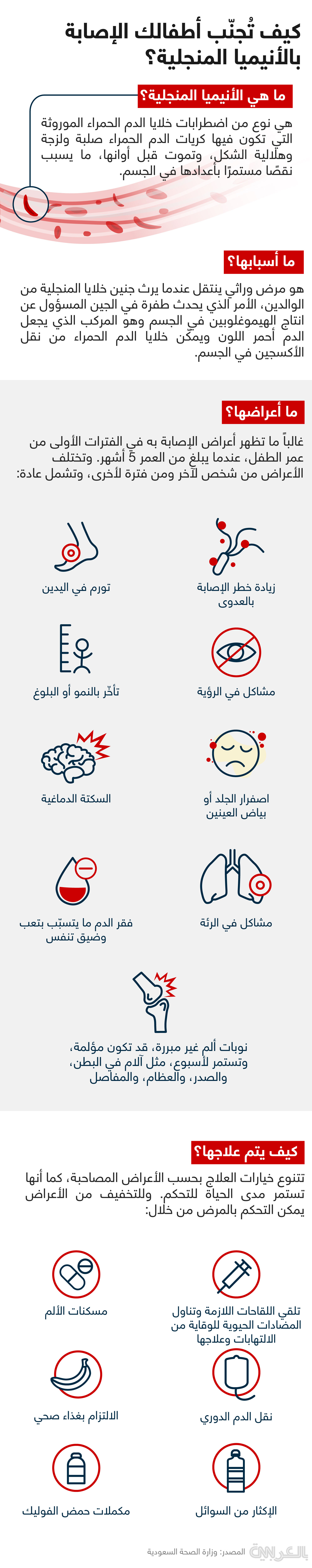
Sickle cell disease infographic
Tesla production quarterly update 2022 infographic


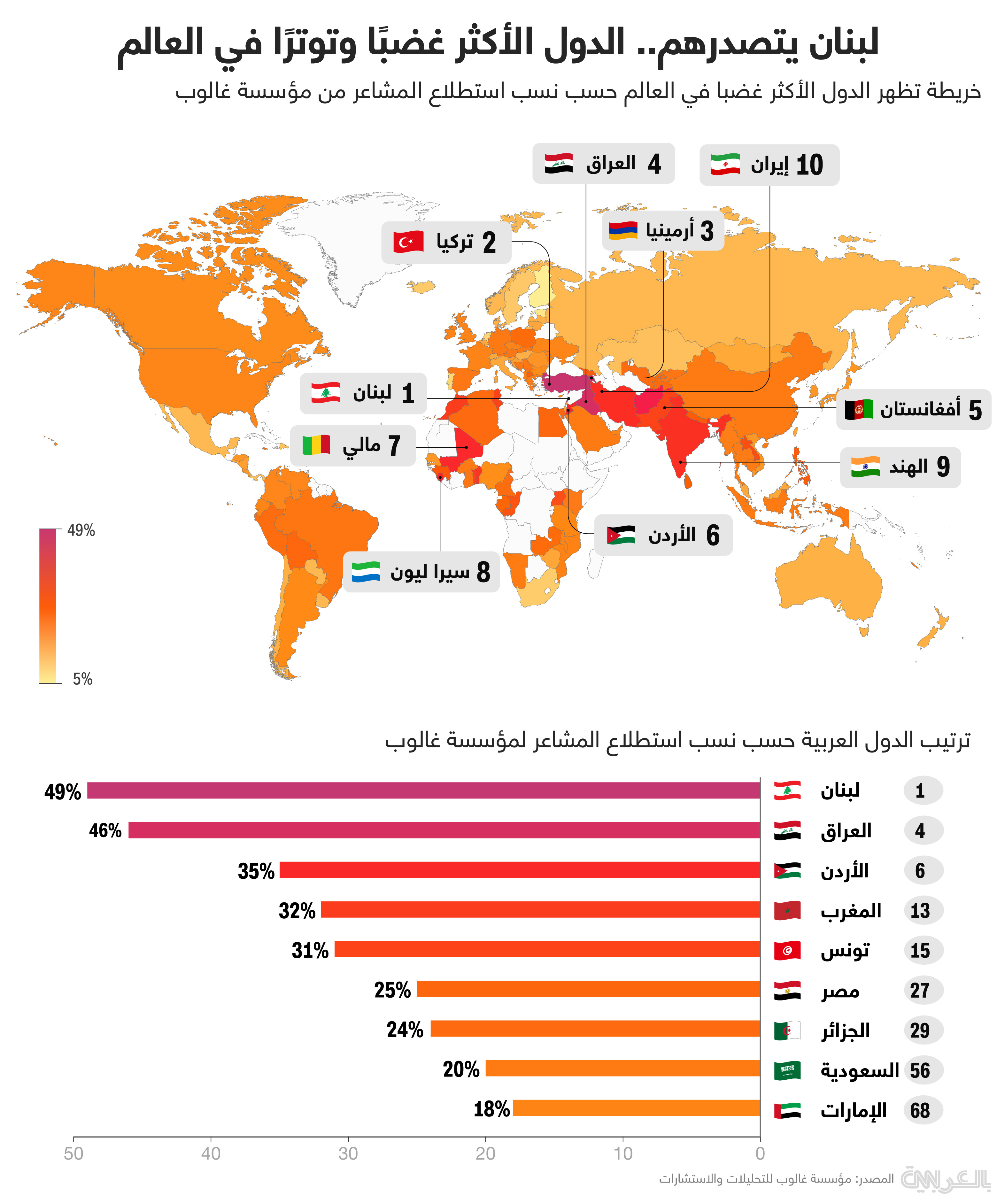
Angriest country worldwide

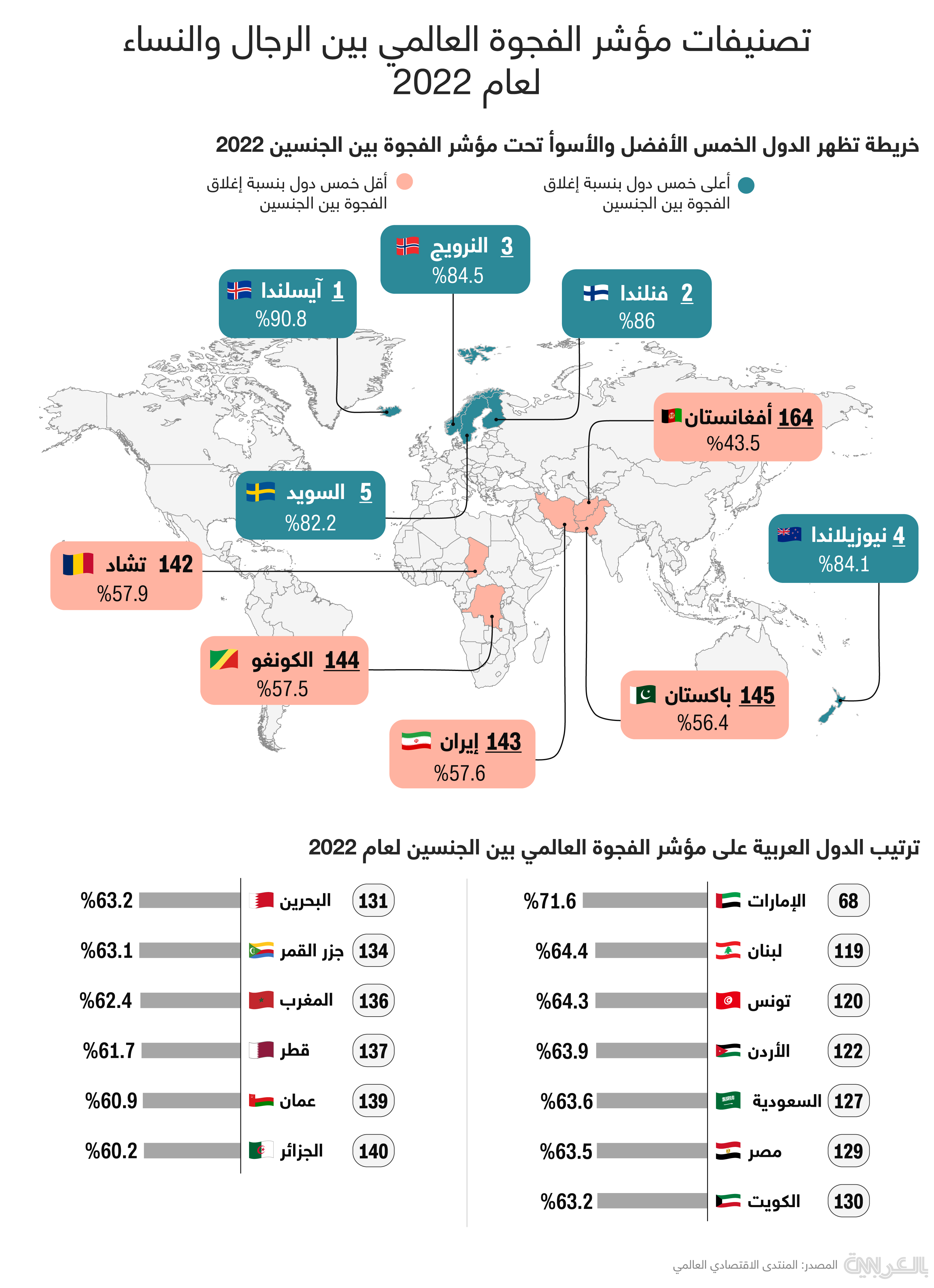
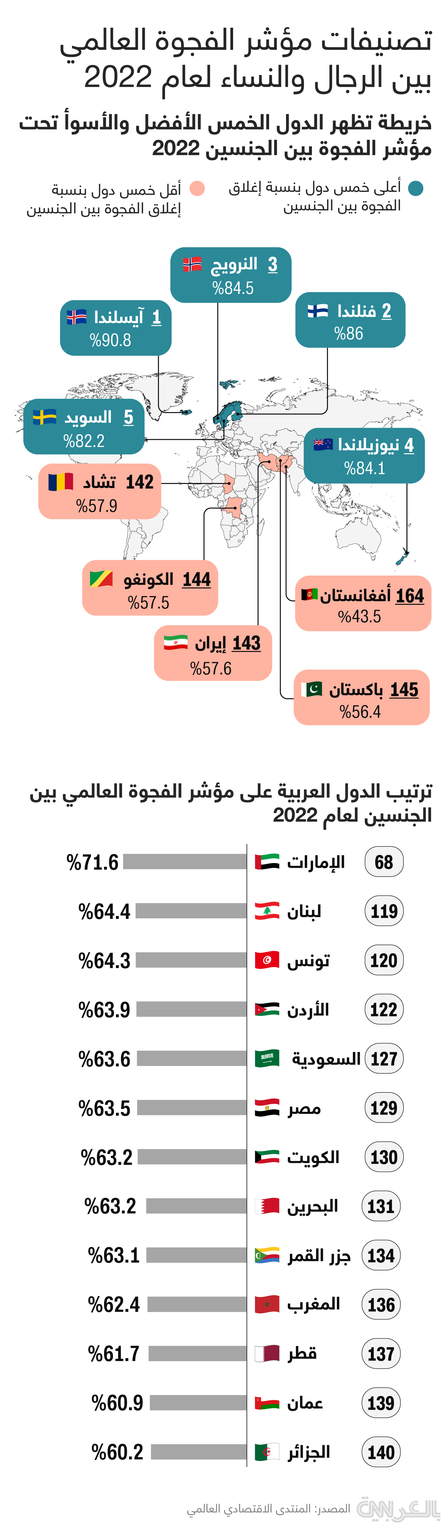
Global gender gap index rankings 2022 infographic
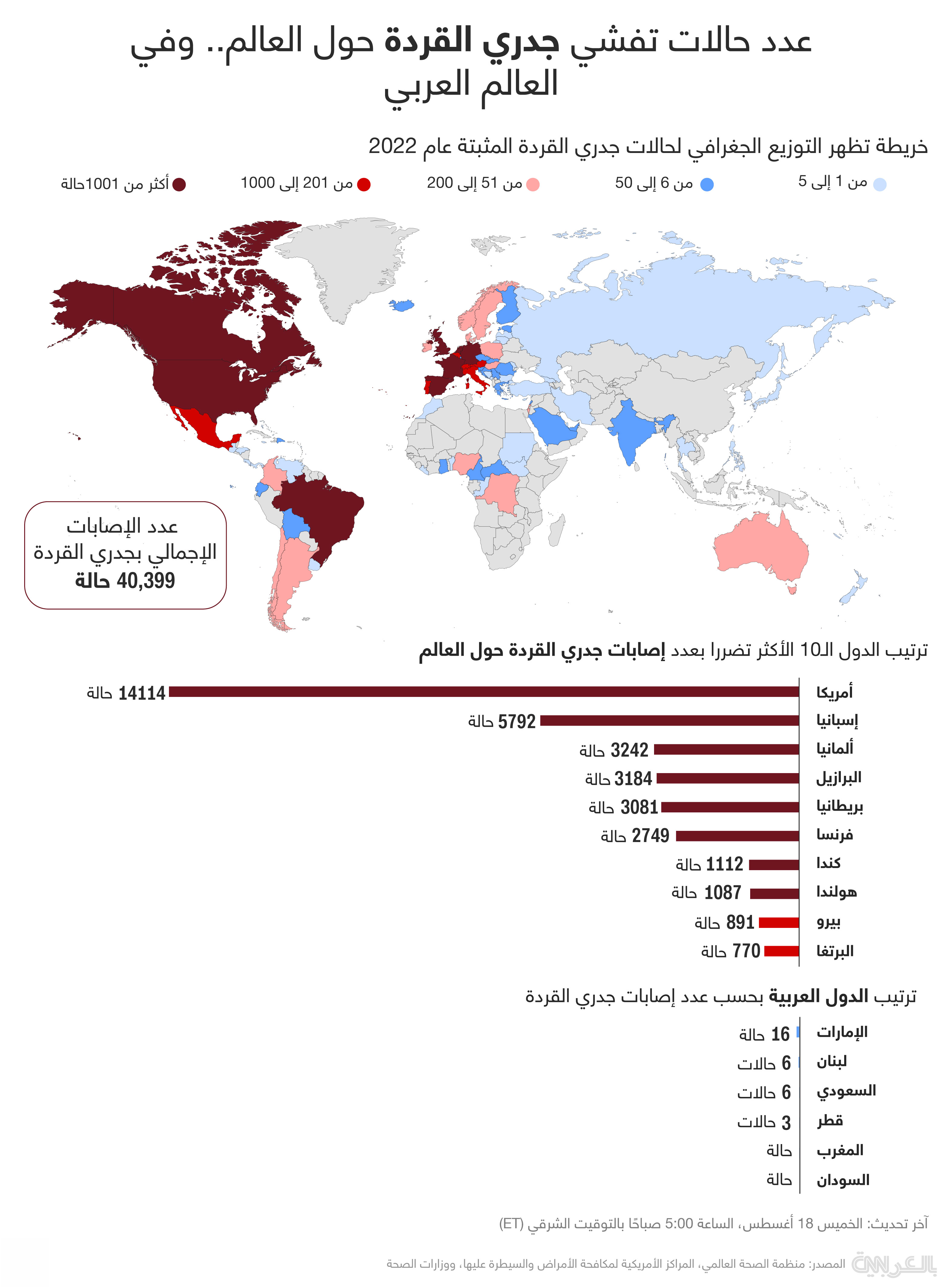
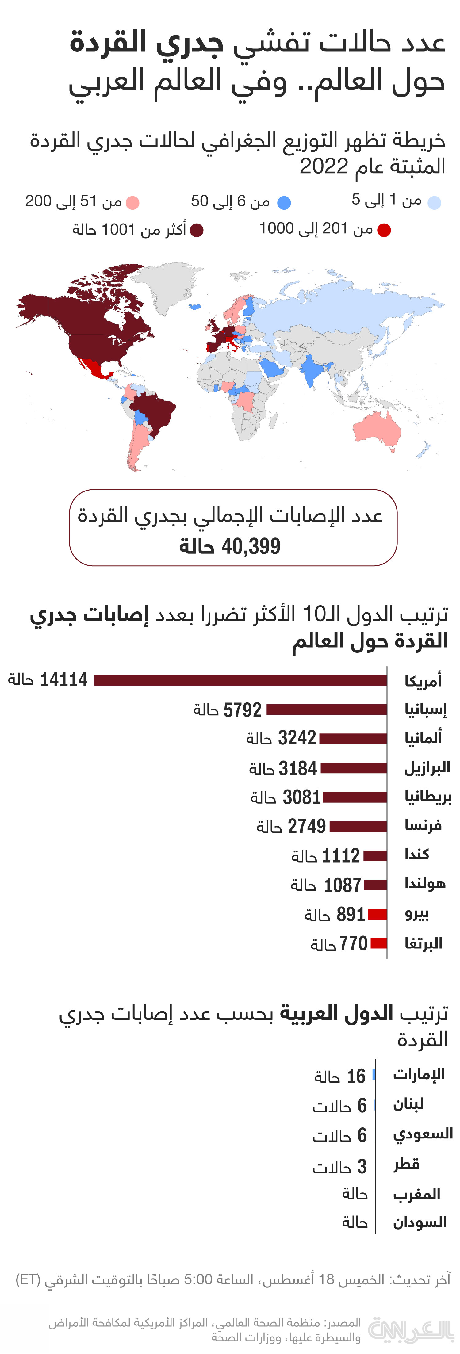
Monkey pox map update August 18 2022
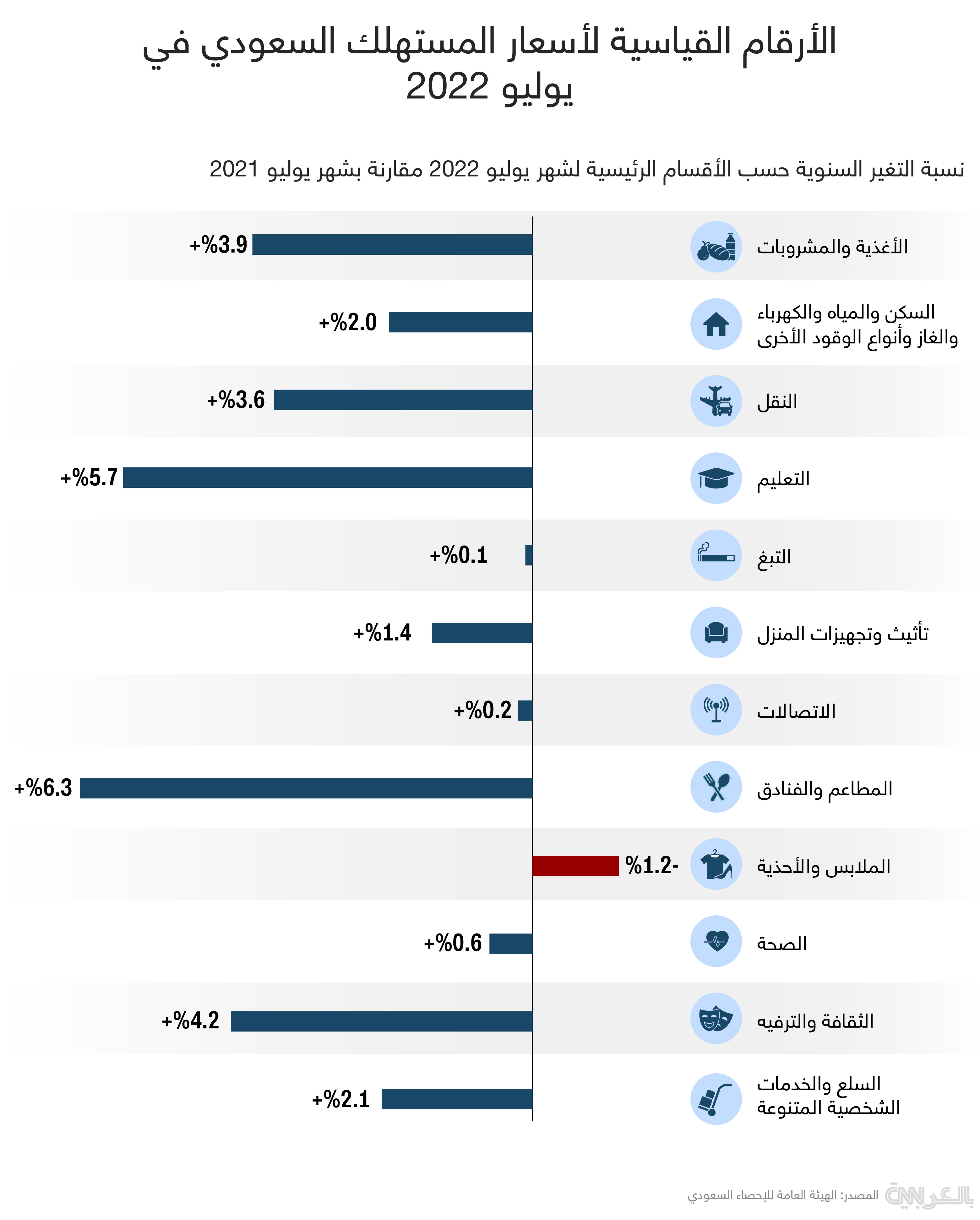
Saudi consumer index August 2022